Ohpaho Secondary School Brand Guidelines and Visual Identity
Leduc, Alberta is set to be home to a new Secondary School. I was fortunate to have the opportunity to work with the administrative team at the school on their branding and to lend my expertise to their branding guidelines.
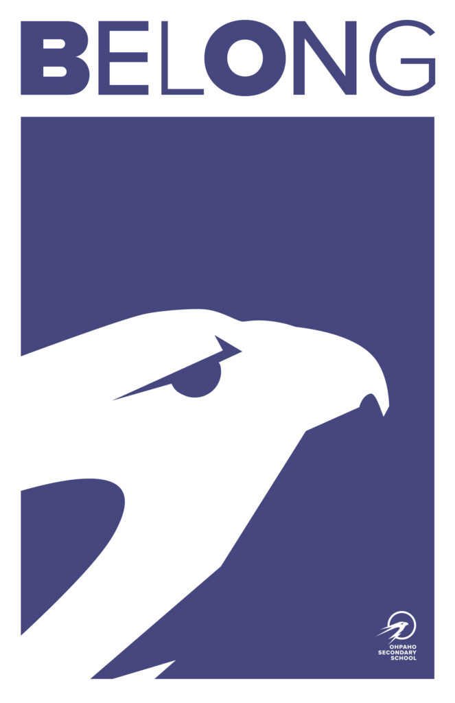
The name of the school comes from the Cree word meaning “to take flight.” As reported by CBC News in April 2022, Ohpaho came at the suggestion of Brian Lightning, language coordinator at the Samson Cree Nation Museum and Archive. He was contacted by one of the committee members.
“I said, we have a term for whatever it is that takes flight … It would probably be really good for a school because of the metaphoric significance — it’s called ‘Ohpaho’ or to take flight. There’s also the metaphor that you’re receiving these children … and by the time they are leaving your institution they are young adults ready to take flight.”
Project Specs
Having grown up in Leduc and being a continuing resident in the area for the bulk of my adult life, it was a true privilege to collaborate on a project that honours the land and the people who have lived here for generations!
The project encompassed the creation of the following:
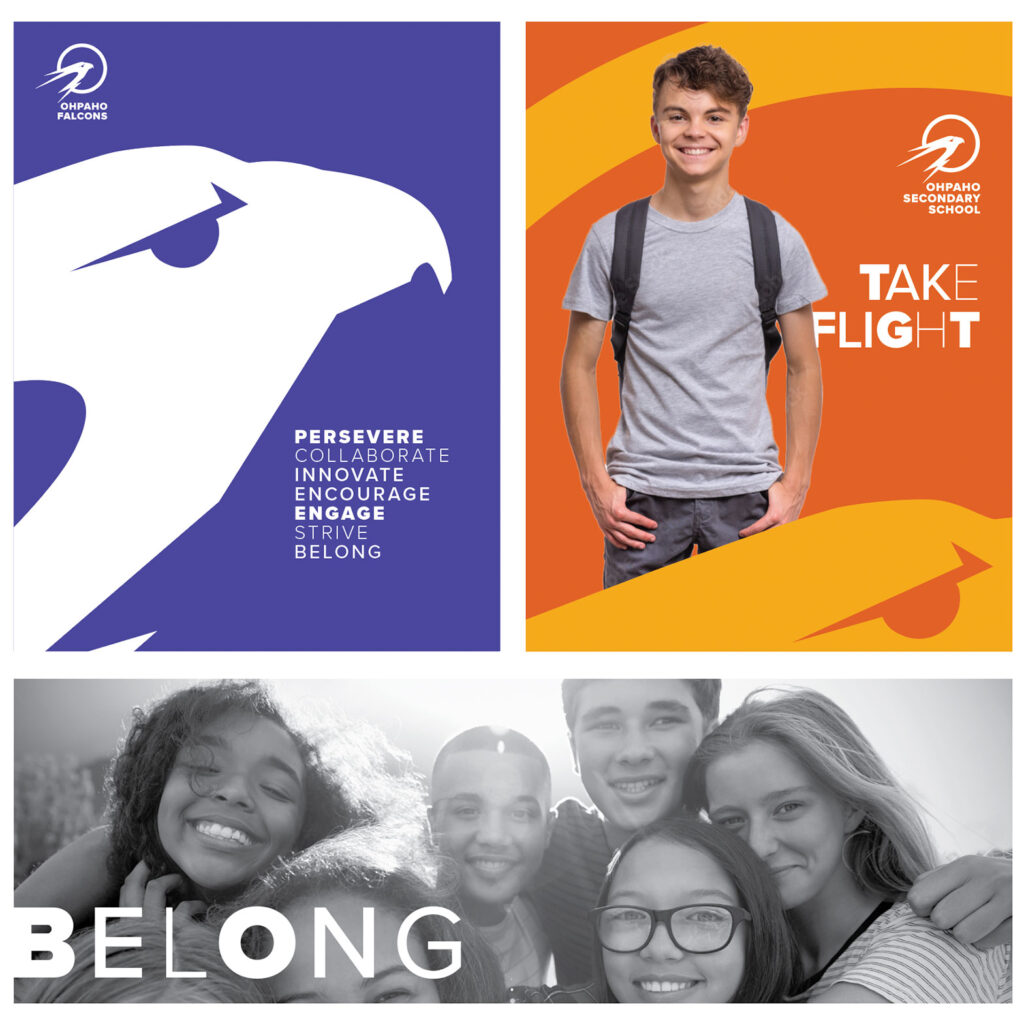
School Logo
Visual Identity Guidelines
Supporting Brand Materials
Merchandise
Gym Center Court Design
Vision and Mission Consultation
Brand Design Philosophy
Throughout the course of this project I was careful to implement my brand design philosophy in regard to both the visual design and the process.
I believe the best logo and brand marks are ones that communicate at their simplest level.
For example, I always work in a reductive manner, starting with the design of a black and white image that can be reduced to around 1 inch in size and still be read and still convey the meanings attached to the brand.
Collaboration is a mainstay in all of my work, but in the case of branding design it is essential. I worked closely with the client giving opportunities for feedback at each stage of the process. In this way, I ensure a level of comfort and ownership of the brand mark and the identity that provides the client with a sense of accomplishment, pride in their design and excitement for how they will implement it.
A very exciting component of the visual identity: a bank of patterns to implement across various media and materials.
The visual identity uses Proxima Nova as a primary typeface. A clean sans-serif font with a variety of weights.
The photographic and dynamic visual direction for the school is designed to focus on fun, diversity, community and postitivity.