My, how time flies. It’s been 19 days since my most recent post. My apologies, life has been very busy, but that’s not why you are all here so I will spare you all the wonderful details. This post will take you through a very quick breakdown of some of the processes I’ve gone through with backgrounds.
It occurred to me the other day, as I wrestle feverishly with a test background for Our 1984, that I am approaching part of the layout of the book in a similar fashion one would an animation. This has not occurred by any planning on my part. Which leads me to believe I’m either relying on my previous experiences with animation or it’s an indication of the desires of my inner creative core. Like a pack of renegade toddlers ambushing me from the thicket, this took me by surprise because I have tried to approach this whole project with a great deal of intent. When I realized I had been ambushed, I stopped production for a brief moment to look at some of the illustrated stories we own. It seems that many illustrators create images on one surface, providing a very unified and cohesive feel to the work. Look at the work of David Small for example, in The Money Tree, he uses watercolour to create some beautiful and coherent images. No trickery or composing digitally included (I assume). He’s so good… drool! Anyways… I digress. After looking through some books I began to question my approach and I engaged in an internal dialogue that went something like this:
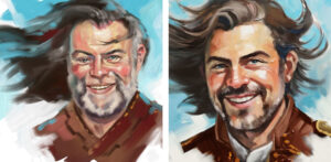
corey: Perhaps I should be painting the characters completely in so they match the backgrounds entirely?
Corey: No no, I’m way too happy with the way the characters are rendering using digital and analog techniques.
corey: You don’t even know what you’re talking about. Look at David Small… Hello!
Corey: I know … gee maybe I’m right.
corey: Exactly. You’re right.
Corey: I am?
corey: Yah.
Corey: Yah I’m right. Just follow my instincts. My gut tells me this is the right path. Thanks!
corey: You’re welcome.
This whole conversation reminded of the inspirational interview with Greg Manchess where he discussed the importance of authenticity. (See previous post Sept 26)
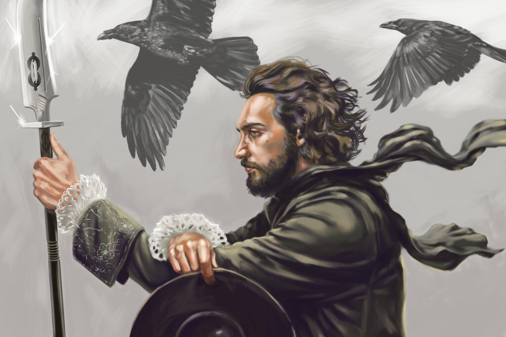
Forging on, after realizing that I had unconsciously begun working on the backgrounds, I embraced the idea of integrating the characters (rendered using ink and digital colouring) into backgrounds which feel reminiscent of those found in animated films or cartoons (completely painted in photoshop). I’m aware of challenges this may create in relation to perspective and scale but welcome them wholeheartedly.
Without further adieu I give you “background test 1”. (Click it to enlarge the image)

This test background was painted digitally in Photoshop using my 12″ Wacom Cintiq screen. I can’t recall at this moment if I have mentioned I will be doing a portion of the book in Black and White and the other portion in colour. Well now I have for sure. Keep in mind this was the first crack at the background cat and although the image may not feature in the finished book; it has given me some solid building blocks for illustrating the backgrounds.
- As I worked on the image I continually asked myself the question, “How far can I push the fantasy in the coloured backgrounds?” (The coloured sections of the book are the sections where the brothers are in their imagined play time) I was making conscious choices as I went along to keep the image on the border of fantasy and reality. I feel it will be important to the story for the boys imagined play time to still be grounded to reality.
- Because of the setting of this story it is important for the backgrounds to reference rural Alberta. Thus you see rolling hills, a large sky, and mountains in the distance. Even though the rocky mountains were not visible from the acreage we grew up on, they have always held a magical and fantastic quality for me. As a child, they were ever on the horizon of my mind.
- For this book, Shelter, the imagined part of the story takes place in a medieval land where wizardry, dragons and the like exist. The castle in the background gives indication of this as does perhaps the stature of the tree and path on the left hand side of the image.
- It will be of utmost importance to me as I create this book to be very mindful of composition. In this image I have tried to create an engaging composition using light, colour, object placement and atmospheric perspective. I recently came across an interview with comic artist Phil Jimenez in which he discusses composition and storytelling. He describes the process of creating panels for comic books as “choreographing my own movie; part of it, I guess, is imagining if I was the director who had to shoot this film or cartoon, how would I do it? What shots would I pick? What angles? How would i tell the story and have it make sense to anyone?” Great thoughts! I’m going to hold on to those as I go through this process.
- The storm in the top right hand corner will also feature in the story. I’m not telling how … you need to buy the finished book for that little bit of info. *wink, wink*
There you have it. A quick glimpse into backgrounds. I’ve been working on more of the character designs as well and will have more for you on that next time around. As I mentioned at the outset of this post, life is very busy, so I will have more content up here asap.
Blessings
Corey